
Mobile App Redesign / Clickable Prototype
(Please note: This is just a hypothetical redesign for my own amusement and practice, and not an actual project commissioned by the cruise line.)
This is getting to be an old one, but I had fun with it so I like to keep it in the portfolio.
A few years ago, my wife and I took a cruise and naturally, I spent a lot of time playing with the cruise line's onboard mobile app. It was interesting to think about the challenges of designing something that most people would only use for a few days or a week, maybe once a year. Such an app is best limited to the most essential and useful features, and can't have a very steep learning curve. People never want to mess with an unintuitive interface, and they really don't want to do it on vacation!
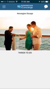
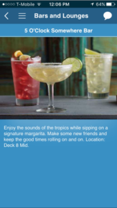
The existing app did a pretty decent job, but there was clearly room for improvement. While the app offered easy access to reservations for restaurants and shore excursions, it didn't offer a clear way to view what you'd already booked. The home screen offered "Things to Do" as a heading but never listed anything. A good replacement might be dynamic content based on what users schedule for themselves.
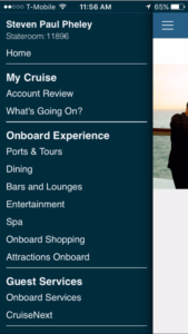
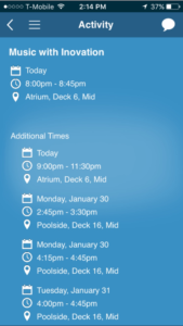
Most of the functions were crammed into a single "hamburger" menu which, as a result, was overwhelmingly large and not very organized. Having read that users tend to find hamburger menus confusing, I sought to break the app's structure into more distinct sections. Some features just provided information that wasn't very actionable and wasn't unique to the app. The schedule of activities to do on board, potentially a very useful feature, was not emphasized and not interactive.
After some sketching and scribbling I established five simple sections to replace that hamburger menu: Account, Reservations, On Board, On Shore, and Messaging.
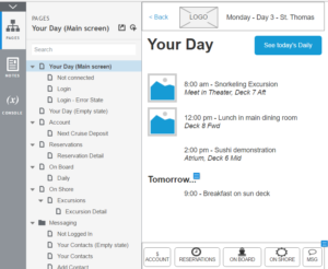
The end result is a clickable prototype and specification doc made in Axure RP 8.